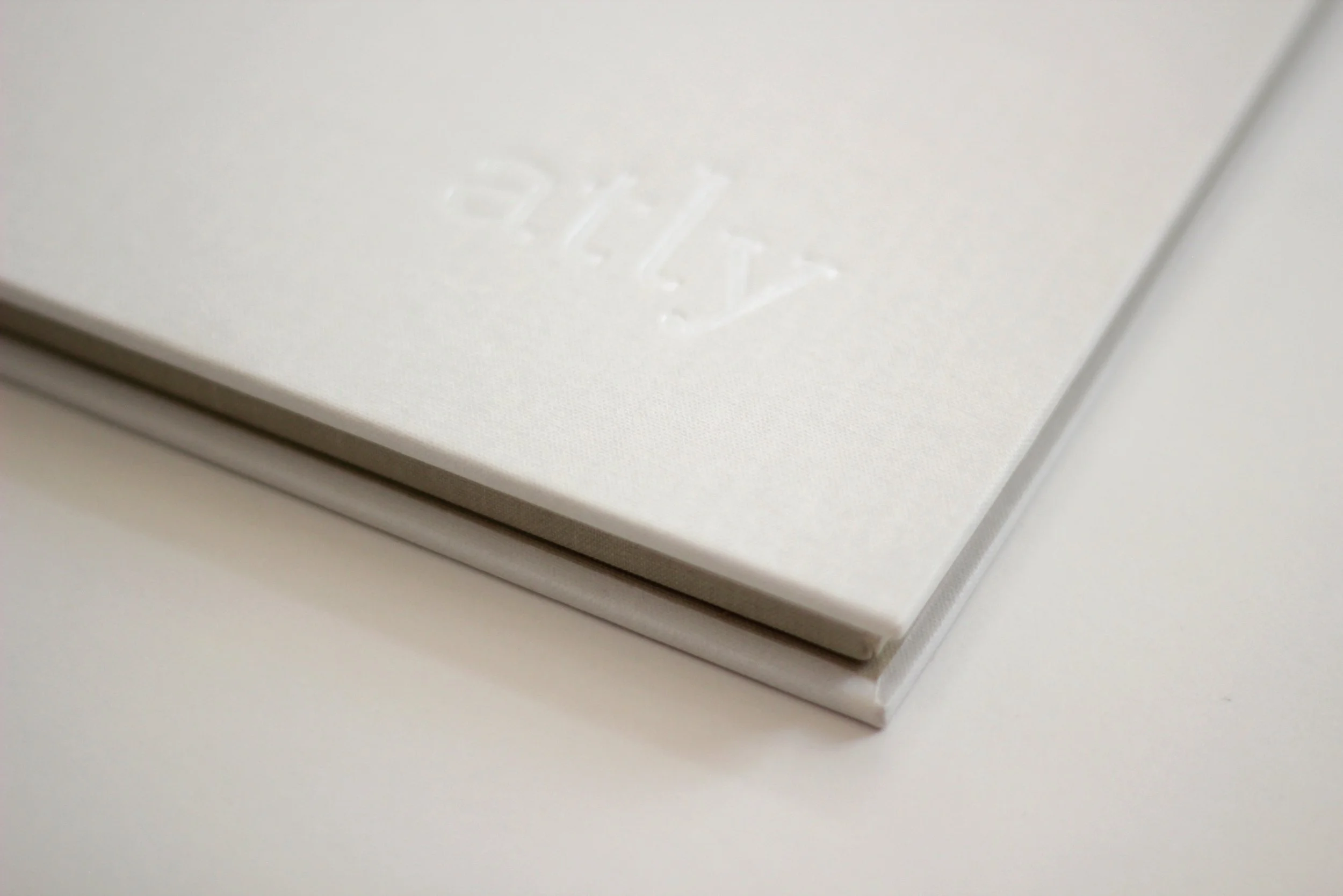
Led the creative direction and design team behind the visual identity for atly.com, an online educational commons for expert creators. Tailored specifically to female makers and artists, the branding balances simple, elegant aesthetics with a touch of playfulness.
Our team delivered a comprehensive design system—including the logo, brand strategy, and starter kit—brought to life through clean patterns, a soft yet bright color palette, and inviting photography that showcases each instructor’s unique personality and expertise.
Client
atly
2012–2013
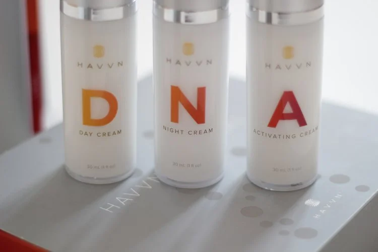
Worked with a team of designers to create the brand for Havvn and packaging for their health and beauty products.
Client
Havvn
2011–2013
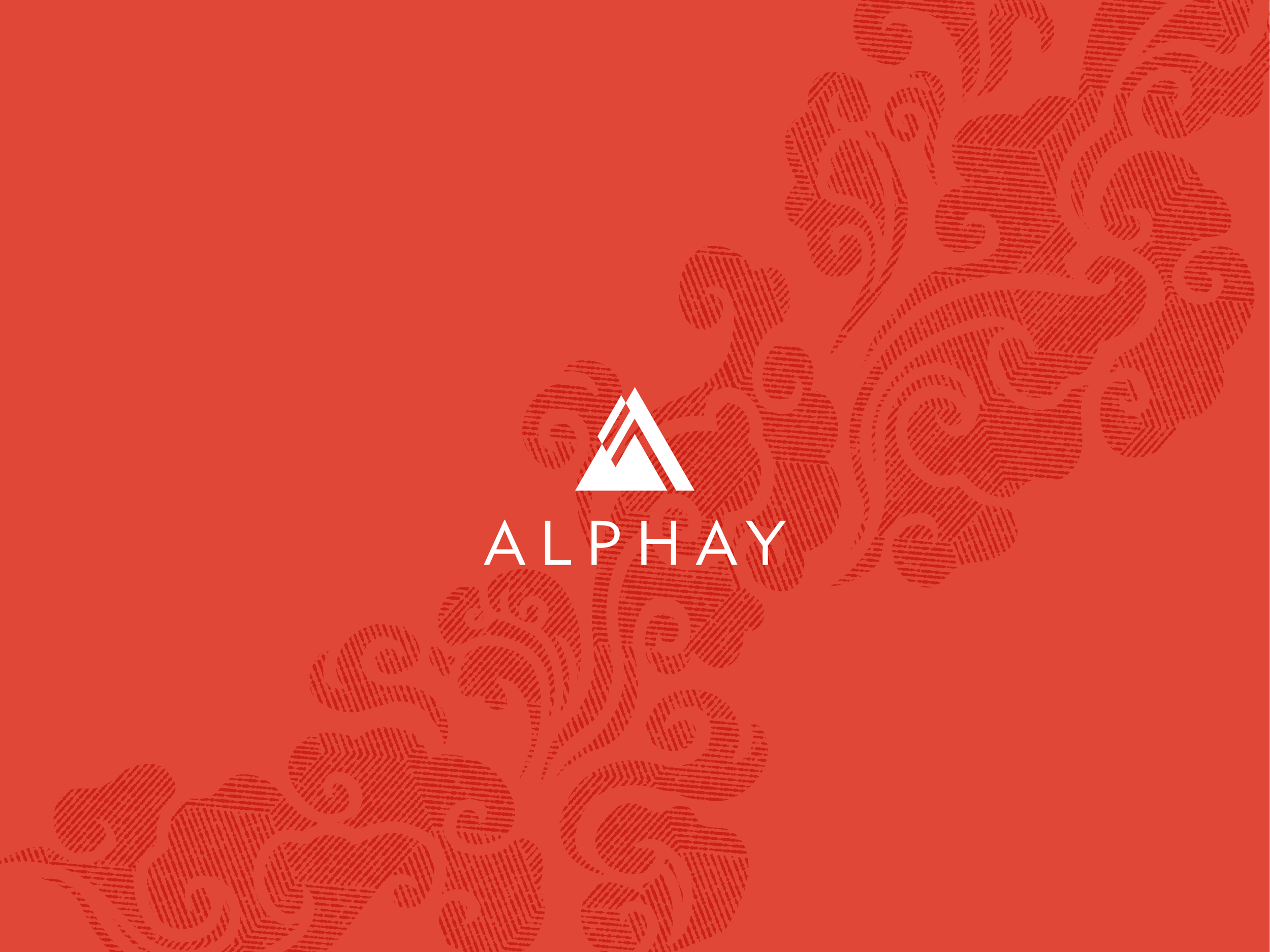
Art directed a team of designers to rebrand the western arm of Alphay, a global health and nutrition company headquartered in Vancouver, British Columbia. The rebrand included logo design, websites, coffee and tea packaging, brochures, event signage, and multiple photoshoots.
Client
Alphay
2013–2015
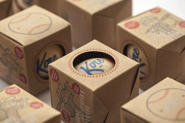
Designed and illustrated custom packaging for Kore baseballs—a hand-stitched training ball with a cushioned core designed to build confidence in young players.
The packaging design captures a 1950s and 1960s vintage aesthetic, combining raw kraft-paper boxes with bold primary colors and custom, hand-drawn illustrations of kids playing ball. By utilizing transparent inks, the natural texture of the kraft paper bleeds through the artwork, adding to the vintage feel of the packaging.
Client
Kore Baseball Products
2014–Present
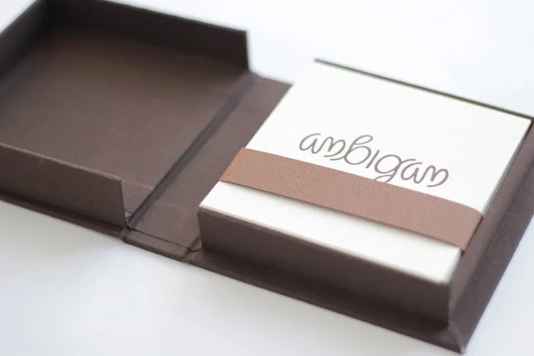
Personal typography project exploring the ambigram—a word designed to remain legible when inverted or rotated 180 degrees. I selected 10 words, created each ambigram by hand, and letterpressed the final designs myself. To package the collection, I used traditional bookbinding techniques to create a custom cloth-covered box.
Client
Personal
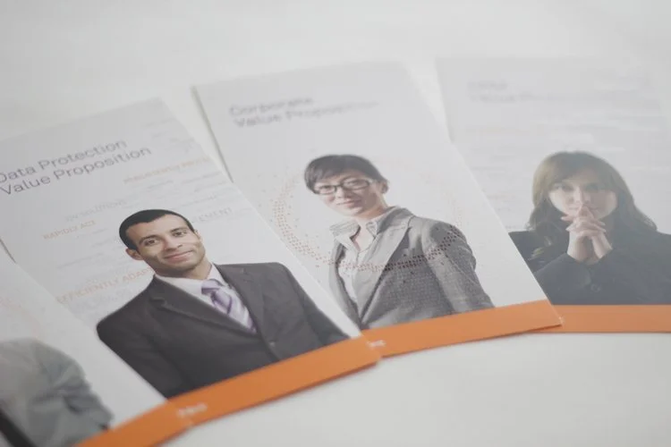
Worked with a team of designers to rebrand SafeNet, based in Belcamp, MD. Safenet is the fifth largest vendor in the security market and third largest provider of information security solutions in the world.
Client
SafeNet
2010–2012
Personal project.
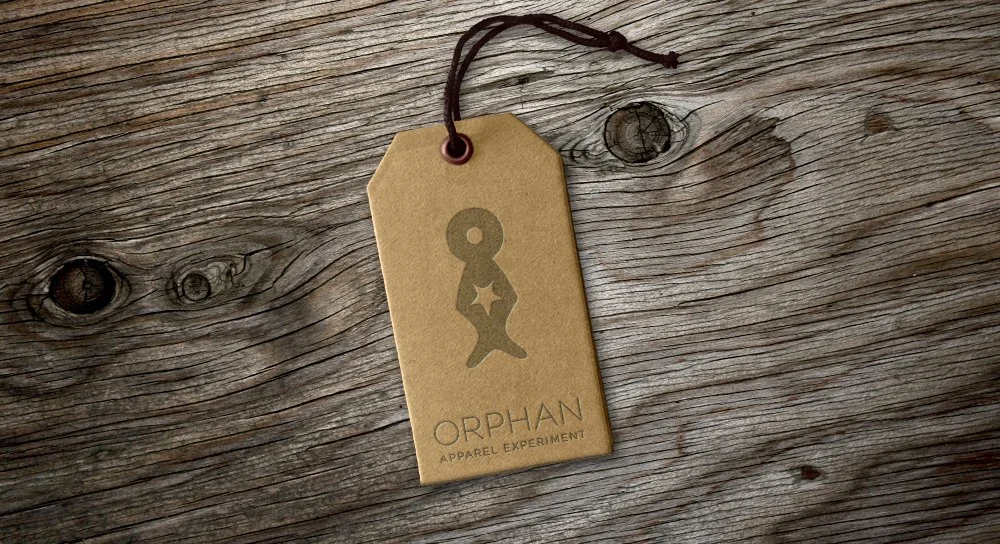
Logo recommendation for a local non-profit skateboard company that would have raised money to help orphanages around the world. The project ended up not moving forward, but the client still continues to help kids with the great Kaiizen Foundation.
Client
Kaiizen
2008
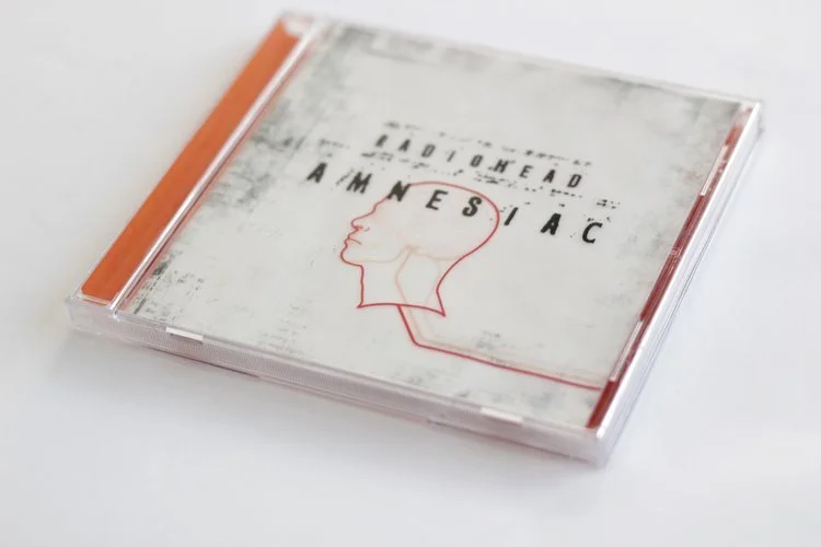
Personal project. My own personal take on the packaging for the Radiohead album Amnesiac.
Client
Personal
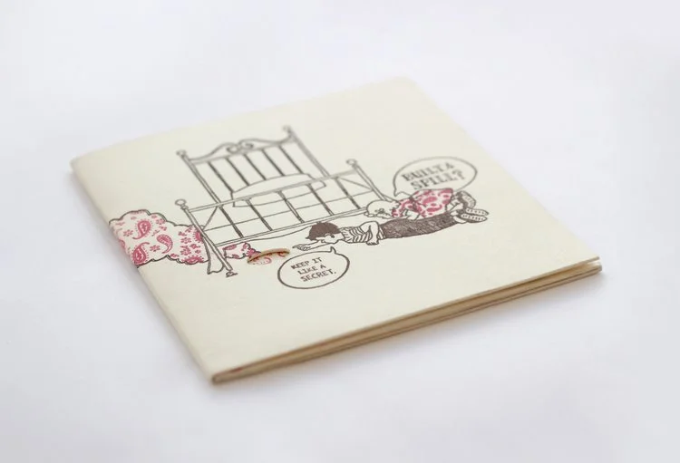
Personal project. My own take on the album packaging for the Built to Spill album, Keep it Like a Secret. I illustrated and personally letterpressed all of the artwork, and put together final product by hand.
Client
Personal
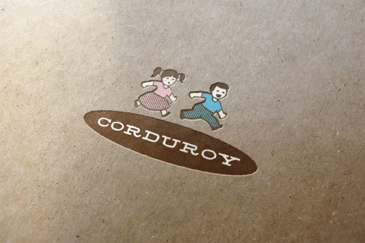
Concept ideation, naming, and brand identity for Corduroy, an original thrift store idea I developed. I created the business idea around a curated secondhand shopping experience. The project includes typography, colors, and retail packaging assets that pairs vintage illustrations and colors with tactile textural elements.
Client
Personal
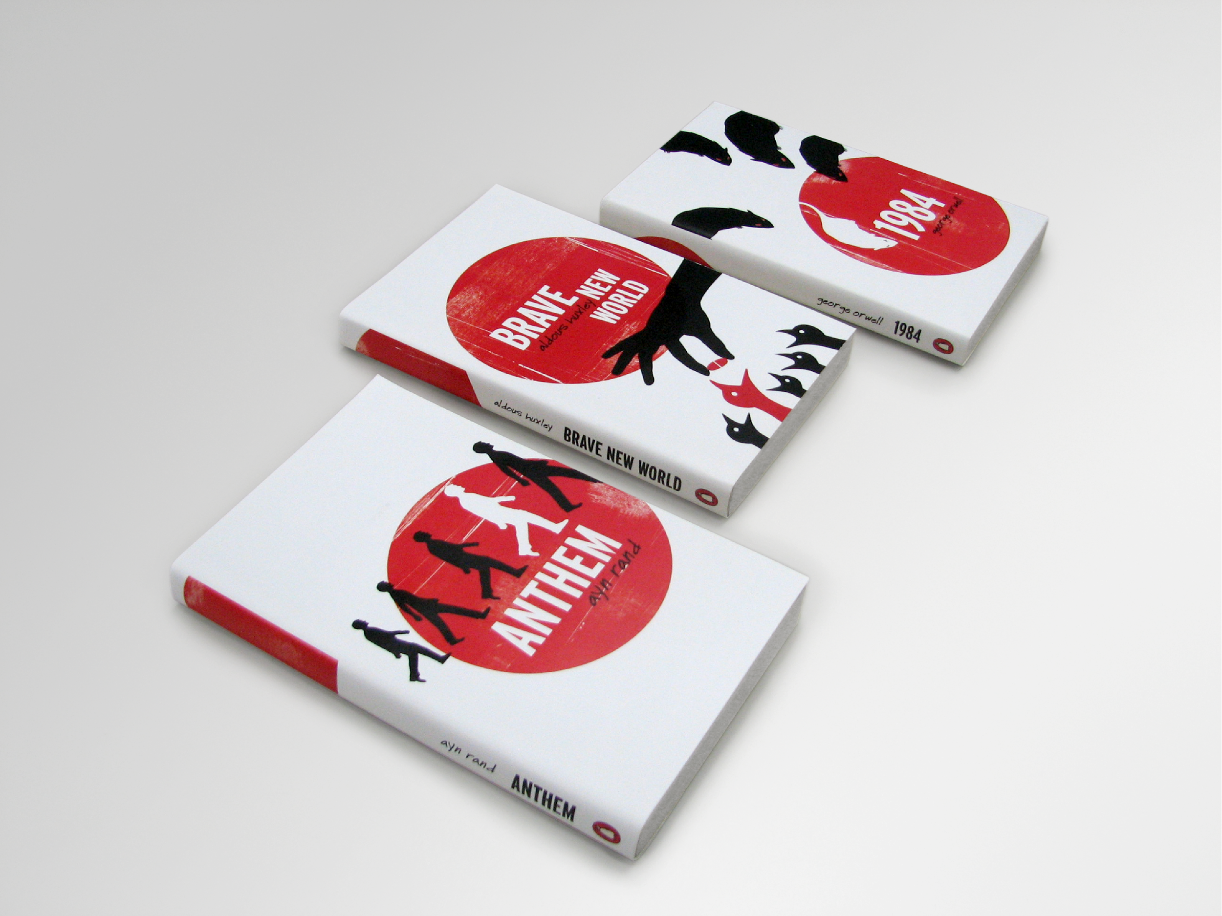
Personal project. I wanted an excuse to design and illustrate a set of covers in a minimalist style reminiscent of the style of Saul Bass film posters and title sequences.
Client
Personal