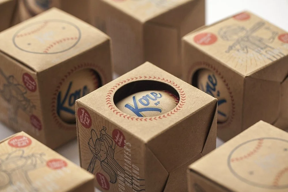
Designed and illustrated custom packaging for Kore baseballs—a hand-stitched training ball with a cushioned core designed to build confidence in young players.
The packaging design captures a 1950s and 1960s vintage aesthetic, combining raw kraft-paper boxes with bold primary colors and custom, hand-drawn illustrations of kids playing ball. By utilizing transparent inks, the natural texture of the kraft paper bleeds through the artwork, adding to the vintage feel of the packaging.
Client
Kore Baseball Products
2014–Present
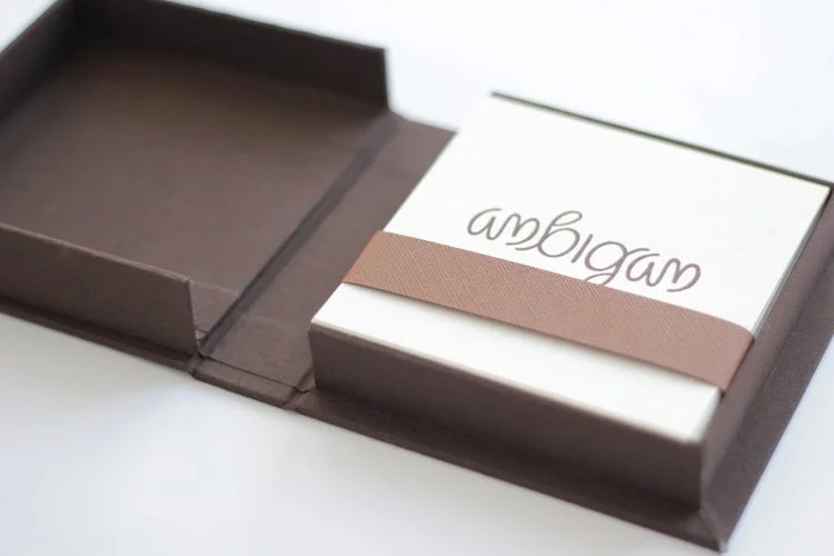
Personal typography project exploring the ambigram—a word designed to remain legible when inverted or rotated 180 degrees. I selected 10 words, created each ambigram by hand, and letterpressed the final designs myself. To package the collection, I used traditional bookbinding techniques to create a custom cloth-covered box.
Client
Personal
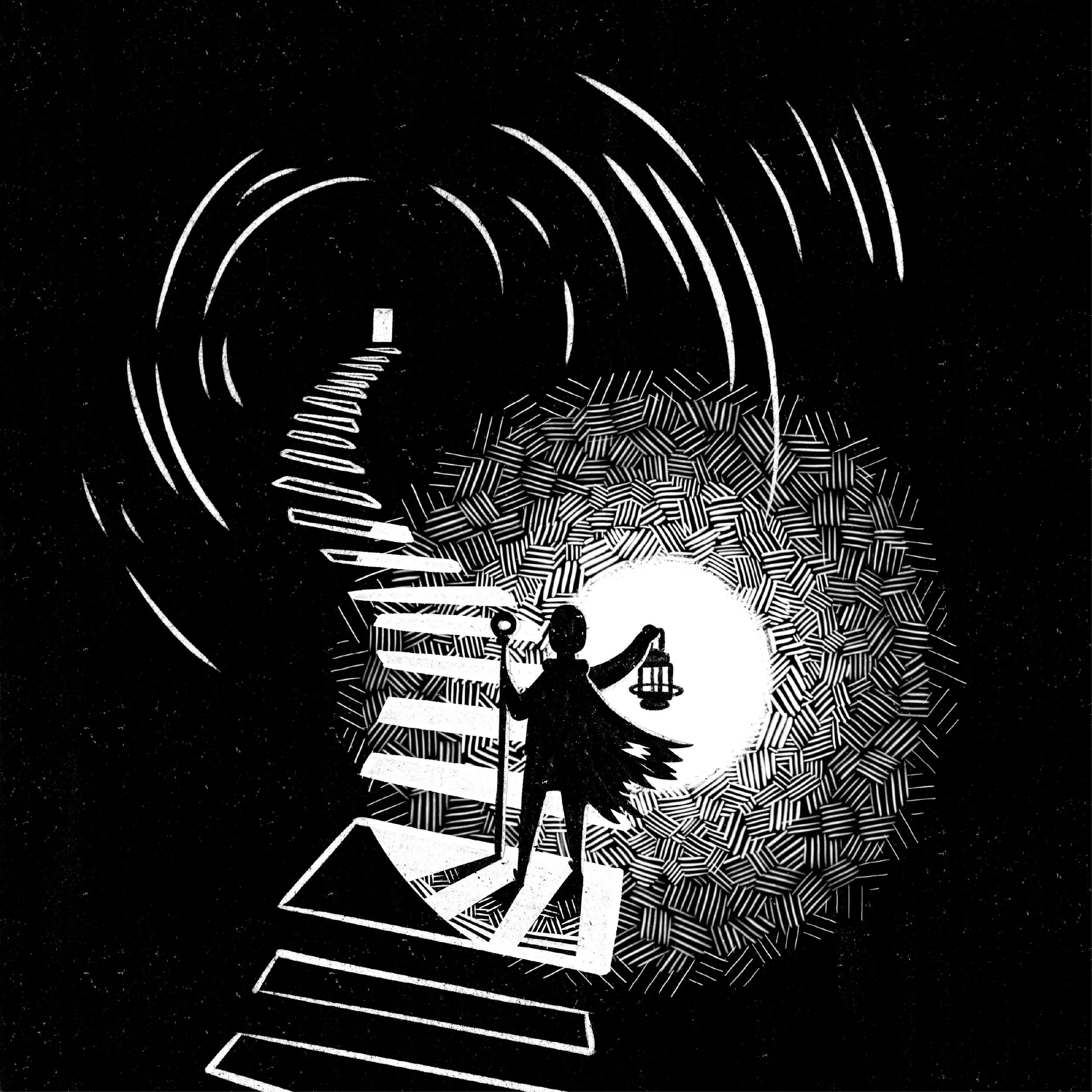
Inktober was created in 2009 as a challenge to improve inking skills and develop positive drawing habits. It has since grown into a worldwide endeavor with thousands of artists taking on the challenge every year. Trying to draw something different every day in October and once a week throughout the year has really helped me continue to hone my illustration skills and helped fuel my creativity professionally and in other parts of my life.
Client
Personal
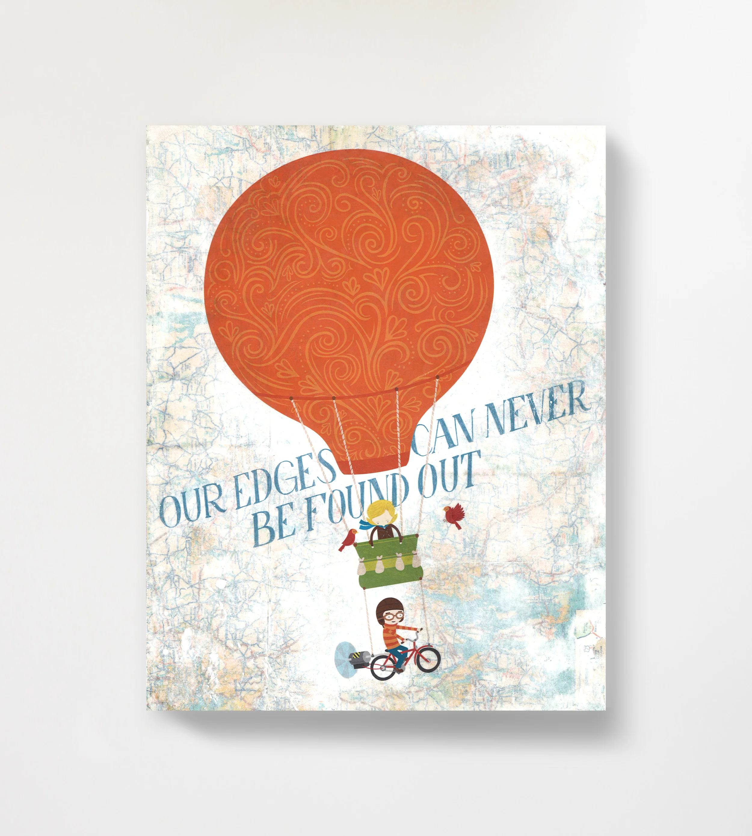
Part of a gallery show on the theme of Travel. The typography is based on lyrics from songs by My Brightest Diamond, Modest Mouse, and Pink Floyd, respectively.
Client
Personal
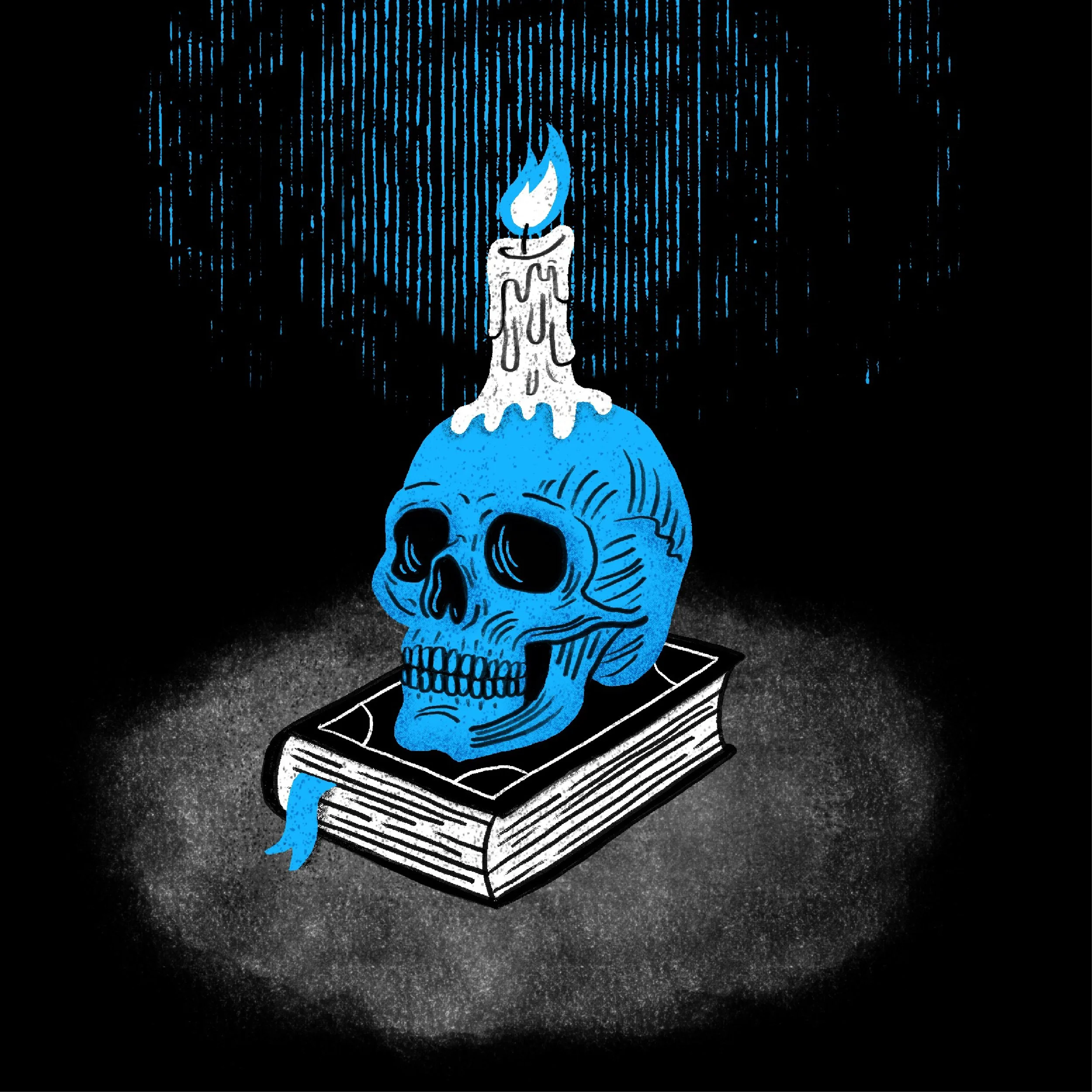
Huevember is a month-long art challenge held every November where artists create one artwork a day using a single, designated color or a limited color palette that moves across the color spectrum.
In 2024 when I participated in Huevember (although it took me until March to actually get through all 30 illustrations), I also worked skulls into all the prompts. It was an interesting creative challenge to work around a different color every day instead of the usual type of prompts you get from something like Inktober. It was especially satisfying at the end to see the full color spectrum across all the pieces from that period.
Client
Personal
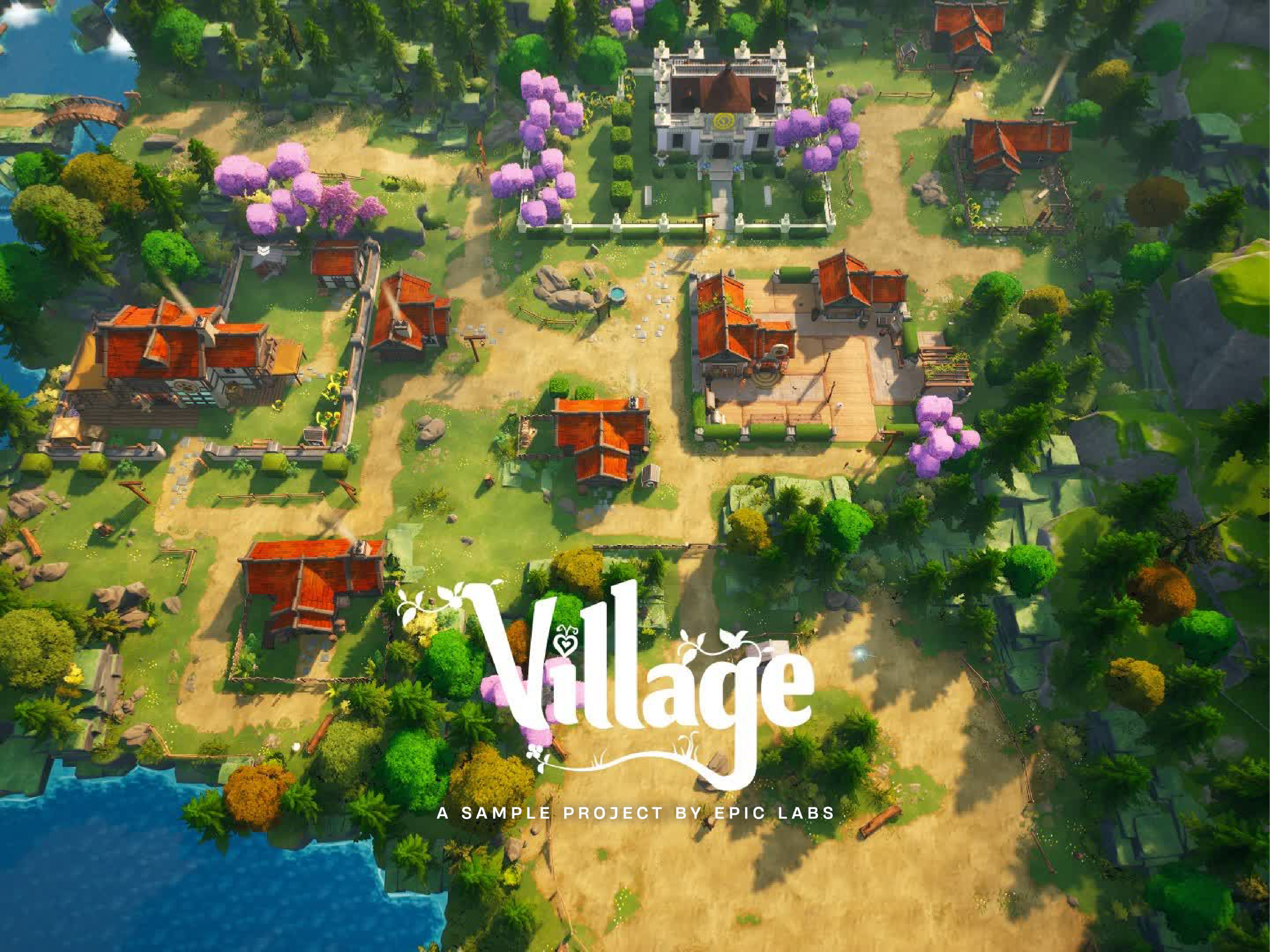
Village is a cozy management sim created by Epic games to show off the latest camera, control, and crafting features in Unreal Editor for Fortnite and Fortnite Creative.
I teamed up with other UI/UX designers to build everything from inventory menus to HUD elements, but my highlight for me was owning the game's iconography. I was able to take a more illustrative approach to create detailed, playful icons that matched the game’s aesthetics, while staying crisp and readable at smaller sizes.
Client
Epic Games
2023–2024
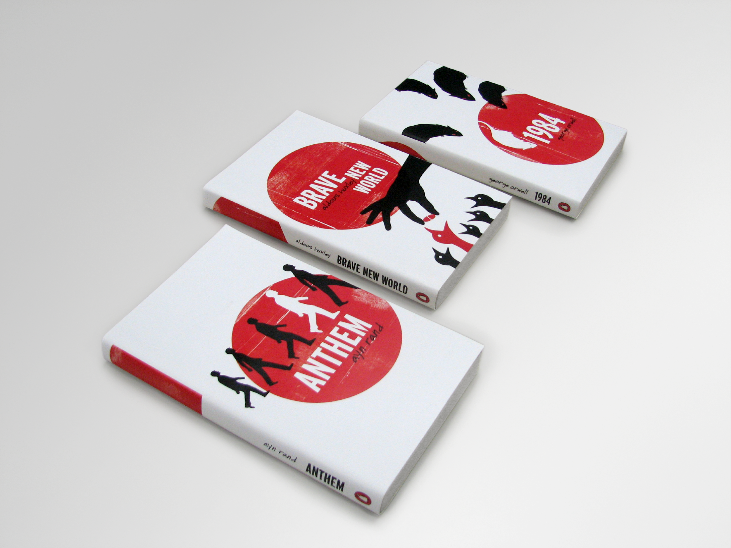
Personal project. I wanted an excuse to design and illustrate a set of covers in a minimalist style reminiscent of the style of Saul Bass film posters and title sequences.
Client
Personal
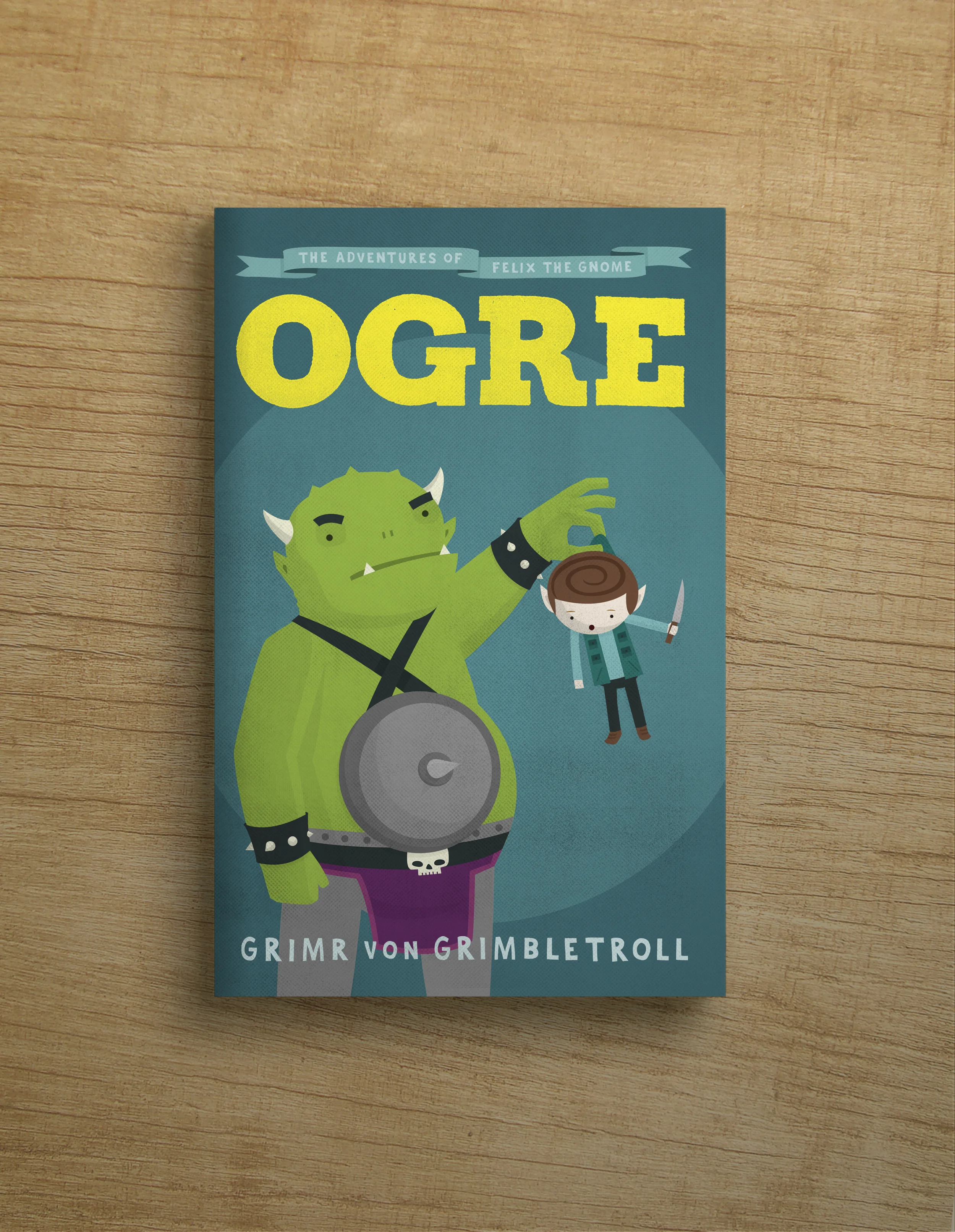
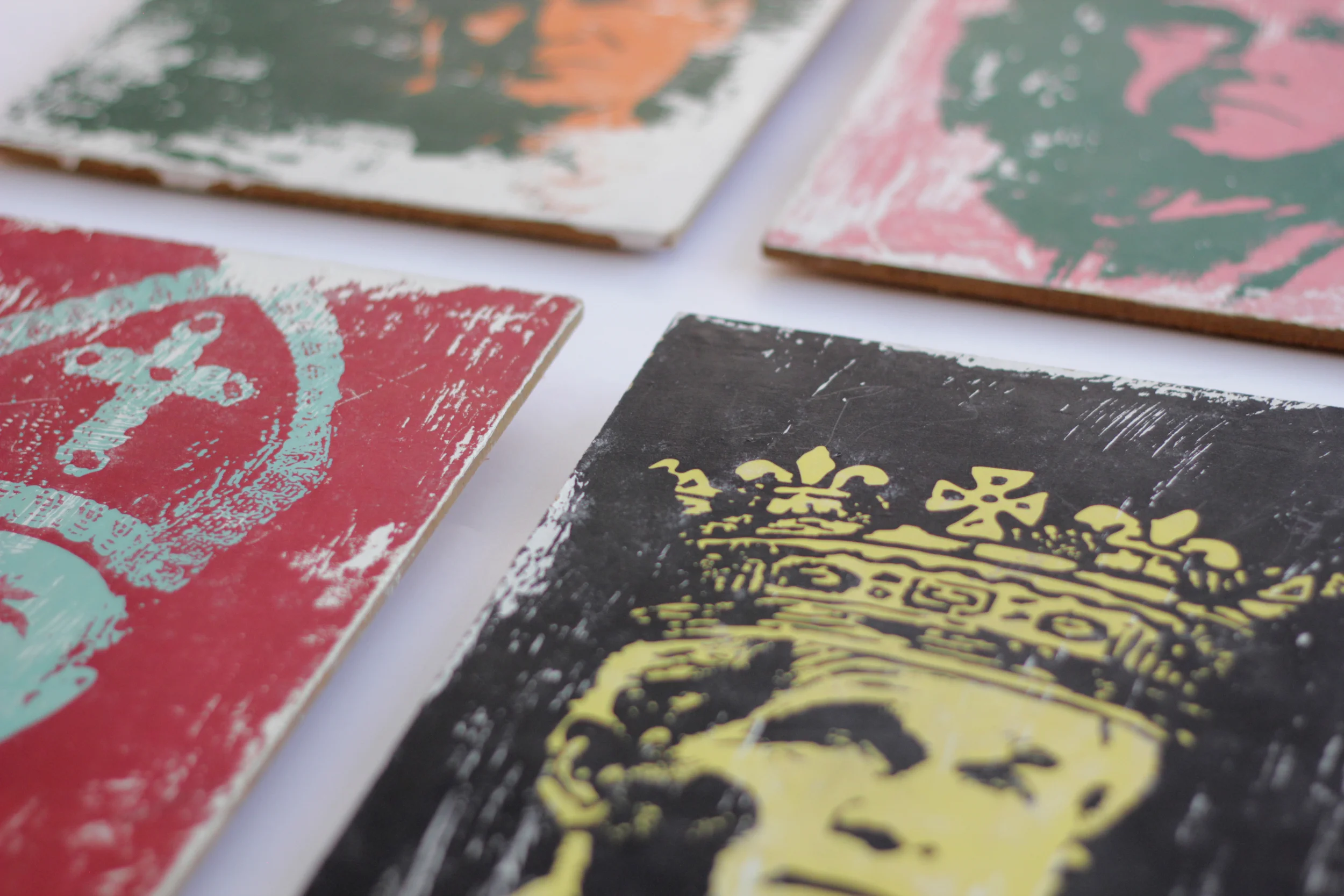
A collection of various personal creative projects from over the years.
Client
Personal
Personal project