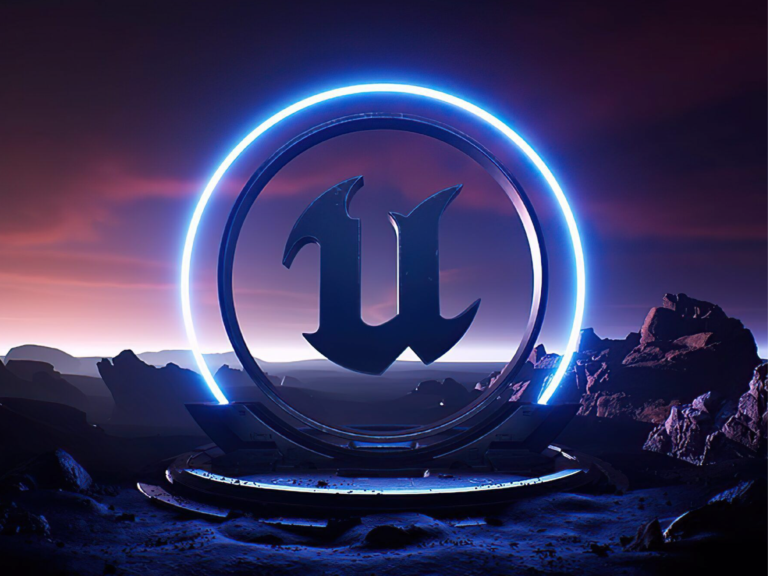
Fortnite is a massively popular online game and platform developed by Epic Games. It launched shortly after I joined Epic, giving me a front-row seat as it grew from its original Save the World mode into a much broader platform encompassing Battle Royale, Fortnite Creative, Fortnite Festival, and more.
Over the years, I worked across many aspects of Fortnite’s UX, designing menus, iconographic systems, HUD elements, and navigational UI. I also designed some of the early UX for mobile gameplay and spent several years contributing to the evolving experience of Fortnite Creative.
Working on such a large and constantly evolving product also gave me opportunities to contribute well beyond a traditional graphic design or UI/UX role. During a brainstorming session, I came up with the name “Fortnitemares,” which became an annual October event, and I designed the Telekineticon Device used to manipulate physics in Creative Mode.
Client
Epic Games
2017–2026
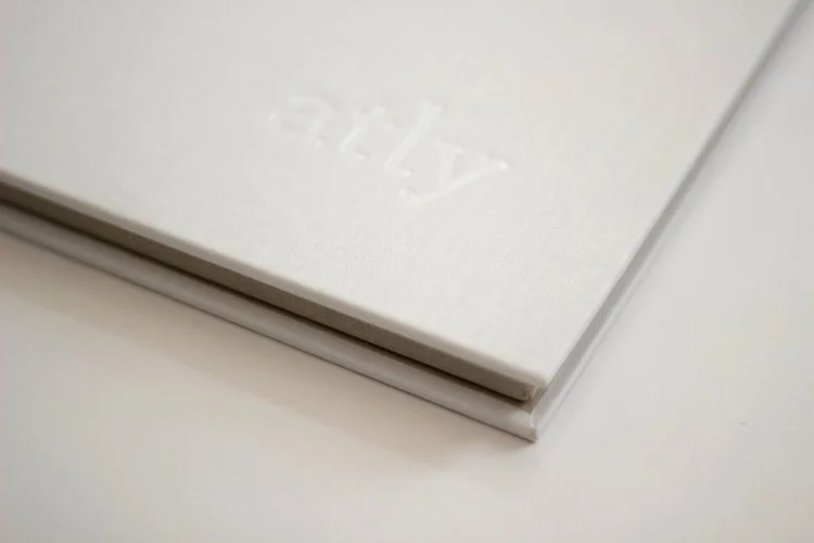
Led the creative direction and design team behind the visual identity for atly.com, an online educational commons for expert creators. Tailored specifically to female makers and artists, the branding balances simple, elegant aesthetics with a touch of playfulness.
Our team delivered a comprehensive design system—including the logo, brand strategy, and starter kit—brought to life through clean patterns, a soft yet bright color palette, and inviting photography that showcases each instructor’s unique personality and expertise.
Client
atly
2012–2013
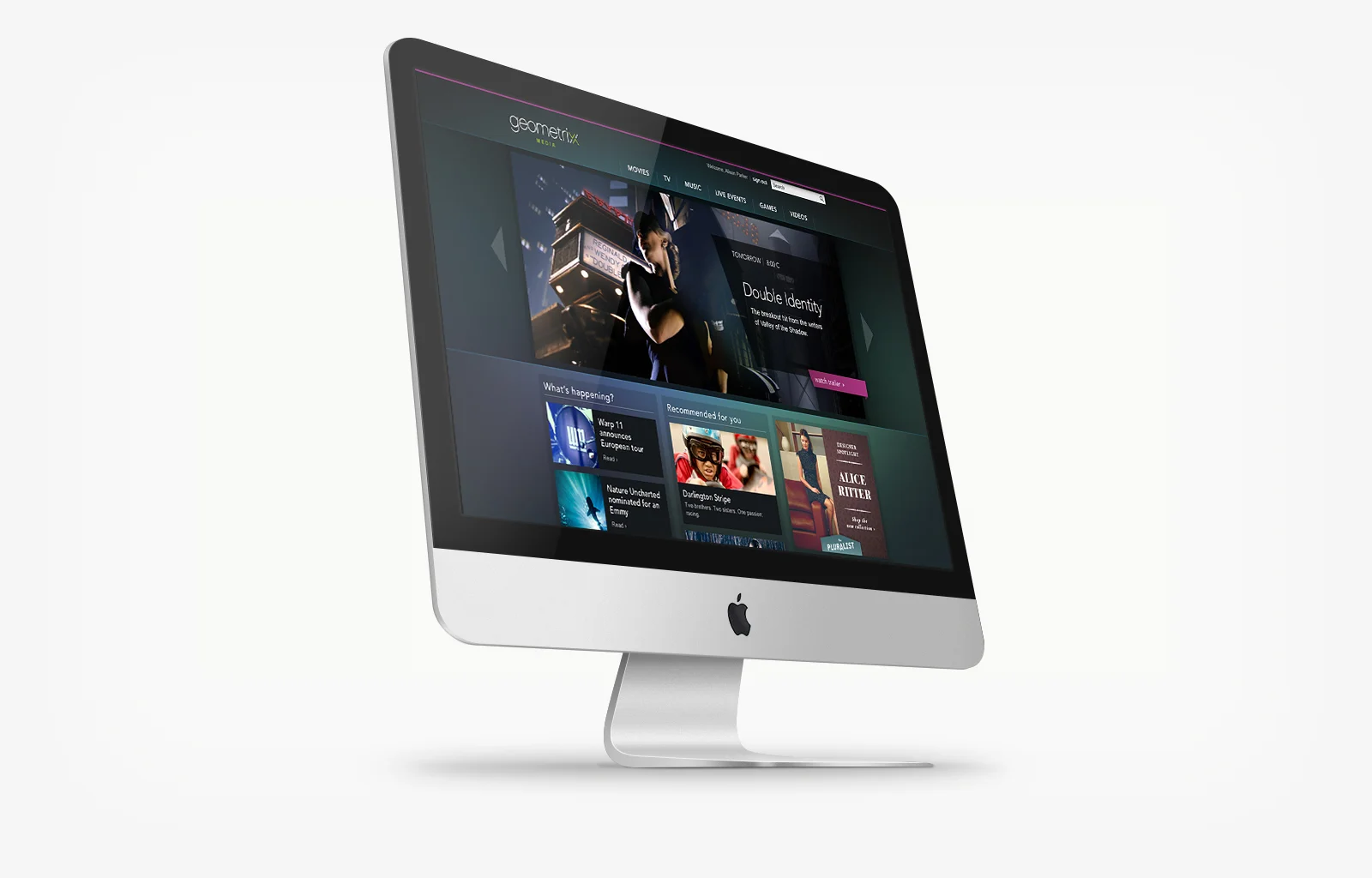
Various digital projects for Adobe's marketing cloud division.
Client
Adobe
2010–2014
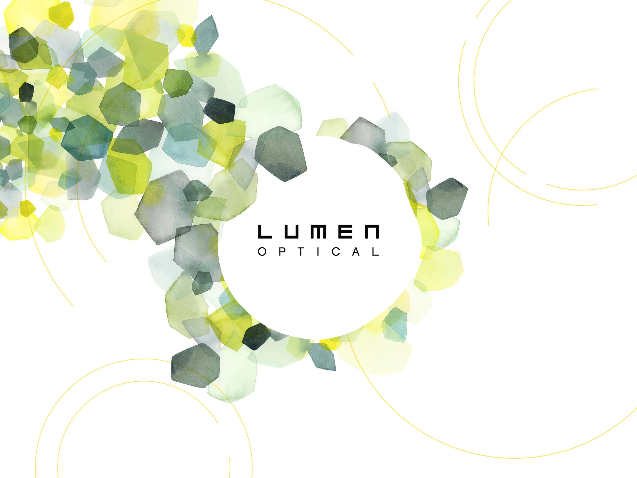
Lumen Optical was a boutique brick-and-mortar concept launched by 1-800 Contacts to modernize the traditional optical retail experience. Designed as an approachable alternative to clinical eye doctor offices, the store featured a signature “Frames Bar” with dedicated style consultants. Under the creative direction of Matt Scherer, I developed the complete brand system, spanning the logo, typography, color palette, patterns, and retail packaging guides.
The final logo draws inspiration from the geometric lettering on eye exam charts and pairs with dynamic graphic circles to mimic viewing the world through different lenses. To emphasize the brand's thoughtful personality, I commissioned original watercolor portraits from Florian Nicolle and textured patterns from Yao Cheng. The identity was ultimately brought to life in Chicago-area store environments designed by Anthony Hadden.
Client
1-800-Contacts
2015
Ciena is a global leader in high-speed connectivity. They build advanced networks that support the growing demand for bandwidth, helping customers, partners, and communities stay connected. Ciena’s networking systems, interconnects, automation software, and services help transform how data is transmitted and networks are managed.
As a long-term client, we had the opportunity to oversee Ciena’s corporate brand strategy over many years. This allowed us to regularly refresh and evolve the brand to stay current with industry trends while continually exploring new approaches to visual storytelling. Under the creative direction of Matt Scherer, I collaborated with other designers and creatives to develop and iterate on the brand, keeping the visual language fresh while maintaining a consistent identity.
Client
Ciena
2010–2016
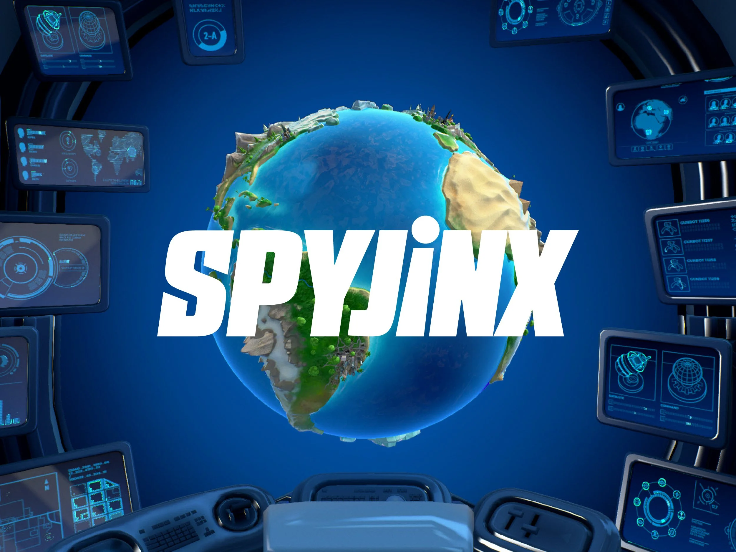
Spyjinx was a mobile game that featured a unique mix of action strategy gameplay, dynamic world building and RPG character development—all set in a thrilling world of espionage. I was personally responsible for designing the entire UX/UI, the Spyjinx logo as well as the logo for the Jinx League within the game narrative, as well as a huge amount of icon work for various aspects of the game.
Client
Chair Entertainment, Epic Games
2015–2020
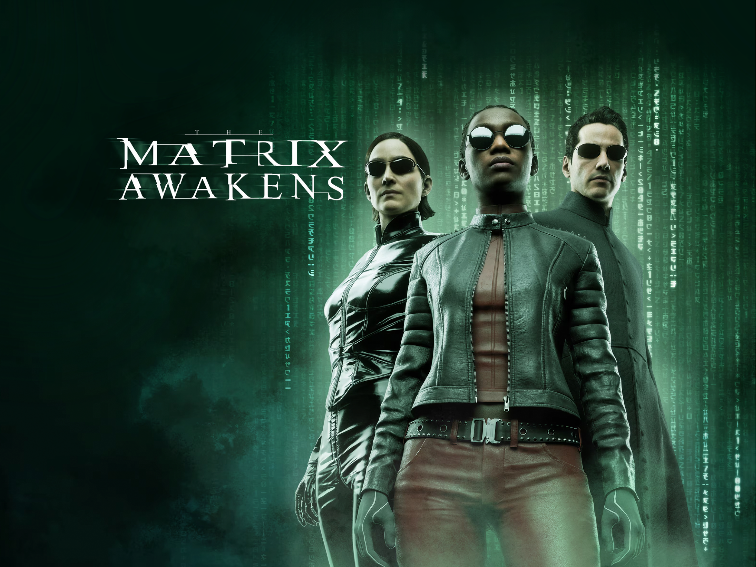
The Matrix Awakens is a 2021 action-adventure game and technology demonstration developed by Epic Games using Unreal Engine 5, in partnership with Warner Bros. Pictures.
I designed many of the key UI elements for the game—including the driving HUD speedometer, menus, maps, button layouts, and weapon reticles—and contributed to the overall UX. Our goal was to combine the aesthetics of The Matrix films and classic green-screen CRT monitors, but with a modern polish.
The Matrix Awakens served as a marketing tie-in for the 2021 film The Matrix Resurrections. It features Trinity (Carrie-Anne Moss) and Neo (Keanu Reeves), along with photorealistic 3D-scanned models of both Moss and Reeves portrayed by themselves. The demo was written and directed by Resurrections director Lana Wachowski.
Client
Epic Games
2021
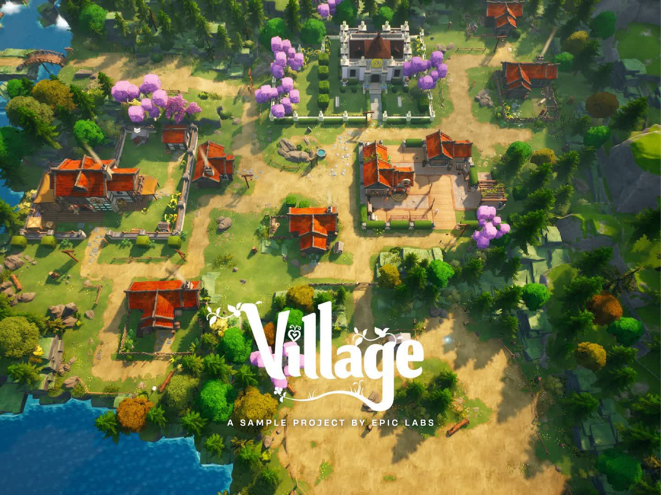
Village is a cozy management sim created by Epic games to show off the latest camera, control, and crafting features in Unreal Editor for Fortnite and Fortnite Creative.
I teamed up with other UI/UX designers to build everything from inventory menus to HUD elements, but my highlight for me was owning the game's iconography. I was able to take a more illustrative approach to create detailed, playful icons that matched the game’s aesthetics, while staying crisp and readable at smaller sizes.
Client
Epic Games
2023–2024
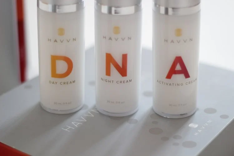
Worked with a team of designers to create the brand for Havvn and packaging for their health and beauty products.
Client
Havvn
2011–2013
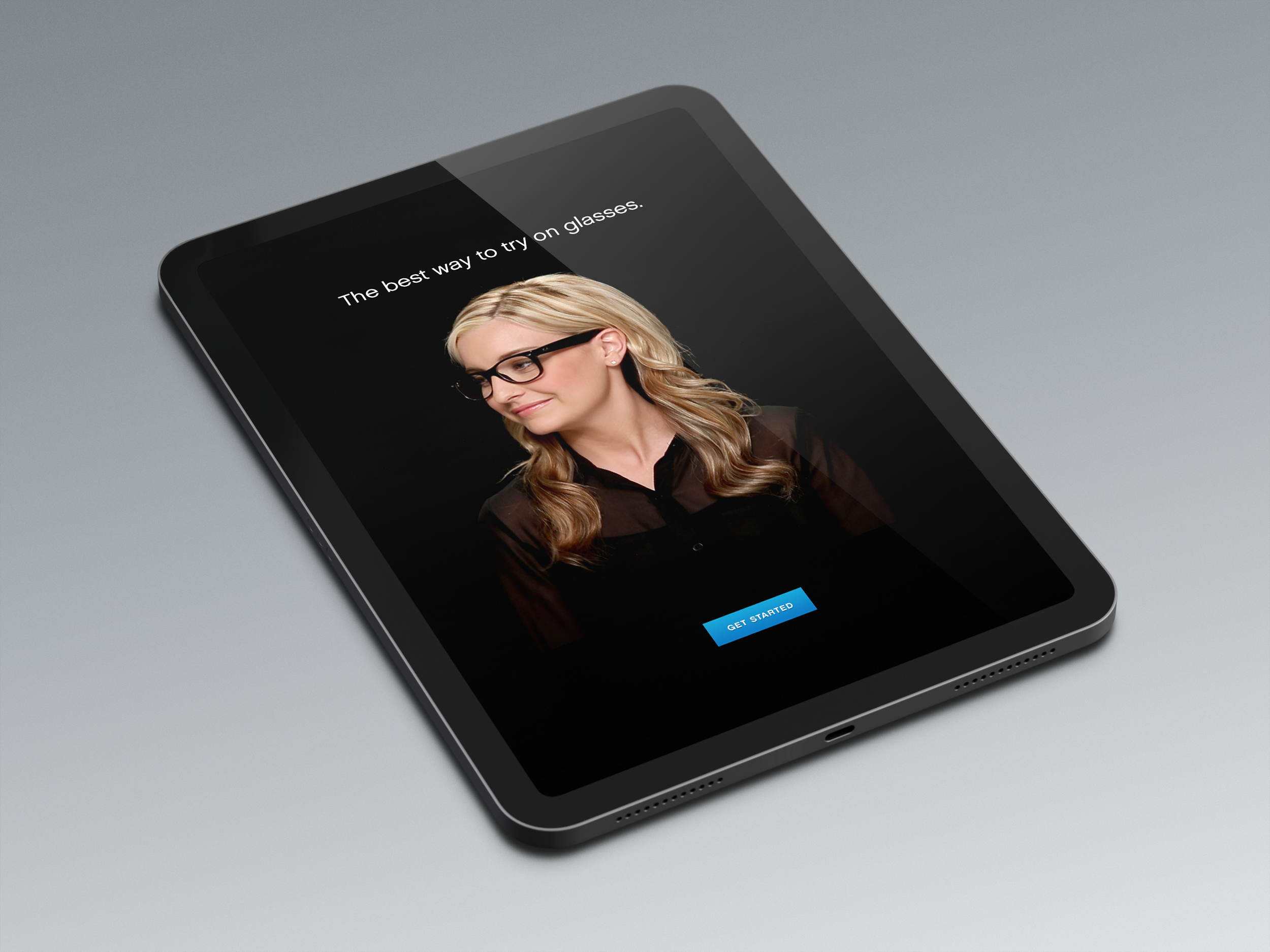
Worked with a team from Axis41 and glasses.com to create the user experience and user interface for the glasses.com 3Dfit app.
From glasses.com: "Using your device's camera, 3Dfit creates a 3D model of your face. The model is paired with scans of 2,000+ frames in our inventory, creating an interactive photorealistic image. Unlike other virtual try-on technology, with glasses.com for iPad and iPhone you can try on and view frames from any angle—perfectly scaled to your face."
APP REVIEWS
"Without question, the glasses.com app represents the state of the art in virtual style shopping. It's superb technology that really works and could save a lot of people a lot of embarrassment."
- David Pogue, The New York Times
"The Best: Try on as much as you want without actually having to try it on."
- Ashley Feinberg, GIZMODO
"You don't need to have 20/20 vision to see the appeal of the new and free glasses.com app for iPad."
- Marc Saltzman, USA Today
"Hate Trying On Glasses? A New App Ends The Misery."
- Bruce Upbin, Forbes
"Thanks to a new iPad app by Glasses.com, dragging a friend to the store may be a thing of the past."
- Brigitt Hauck, realsimple.com
Client
glasses.com
2012–2014
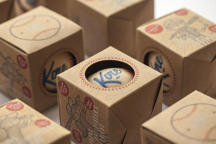
Designed and illustrated custom packaging for Kore baseballs—a hand-stitched training ball with a cushioned core designed to build confidence in young players.
The packaging design captures a 1950s and 1960s vintage aesthetic, combining raw kraft-paper boxes with bold primary colors and custom, hand-drawn illustrations of kids playing ball. By utilizing transparent inks, the natural texture of the kraft paper bleeds through the artwork, adding to the vintage feel of the packaging.
Client
Kore Baseball Products
2014–Present
Worked with a team of designers on a variety of digital and print work for MonaVie.
Client
MonaVie
2009–2011
During my time at Epic games I spent several years designing UX systems, UI elements, and comprehensive icon libraries for Unreal Editor and Unreal Editor for Fortnite (UEFN). By establishing robust visual standards and internal design workflows, our design team streamlined the creator experience and ensured seamless consistency across multiple development teams.
Client
Epic Games
2020–2025
Helped rebrand and create digital and print assets for Sidera (now Lightower Fiber Networks).
Lightower’s network is connected to financial exchanges, data centers, stadiums, media and content hubs, carrier exchange points, wireless towers, enterprise locations and more. Today, the company delivers network services to over 7,500 service locations with more than 20,000 route miles of network, including fiber assets in the Northeast, Mid-Atlantic, and Chicago metro area as well as critical landing stations and exchanges internationally.
Client
Sidera Networks/Lightower Fiber Networks
2013–2015
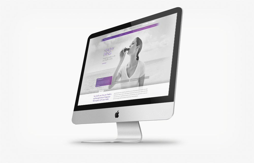
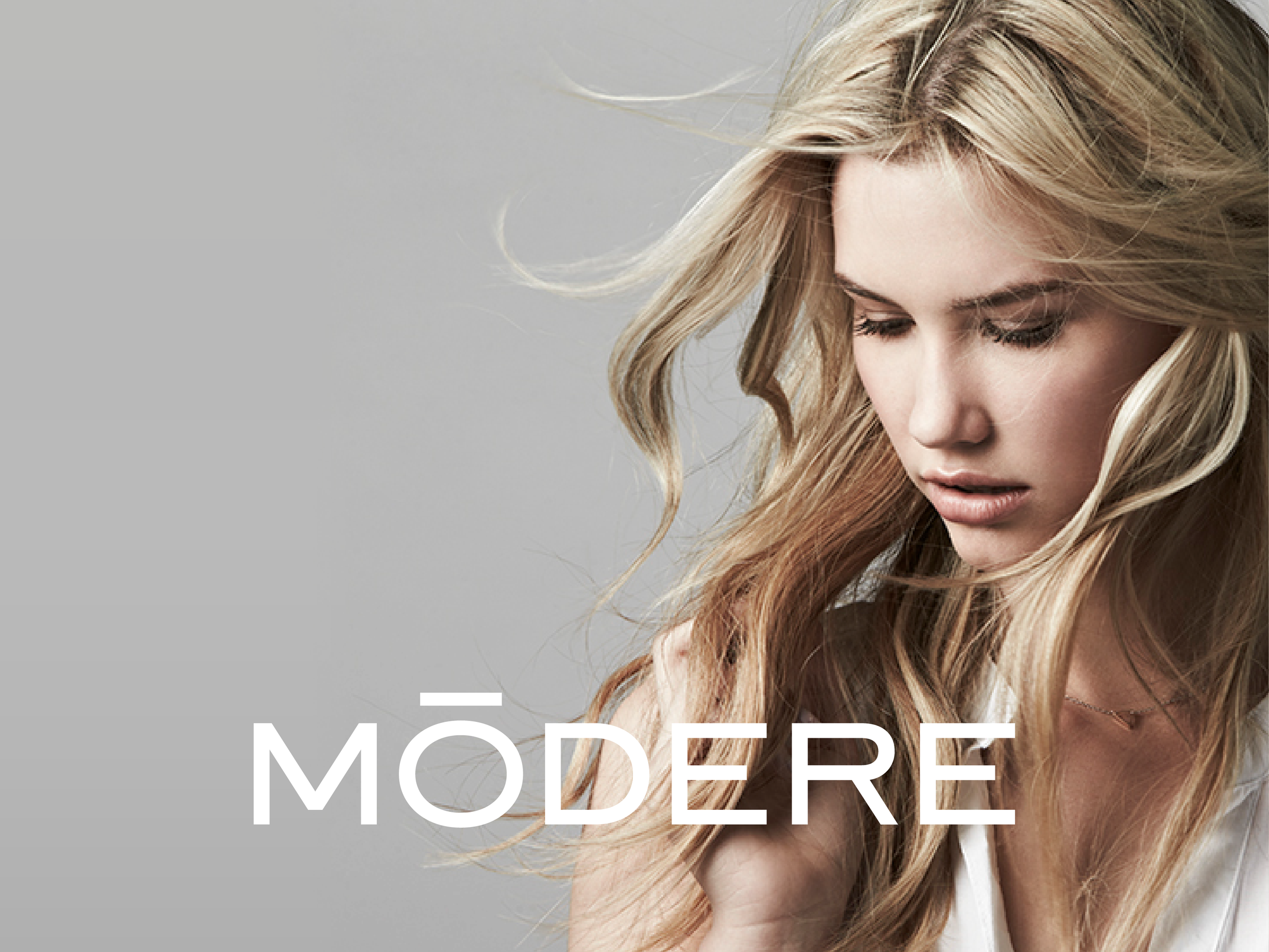
Modere is a global, award-winning consumer products company specializing in clean-label lifestyle, health, and wellness goods—later acquired by Shaklee. Known for pioneering the "Social Retail" direct-to-consumer e-commerce model, the brand has served millions of customers across North America, Europe, and Asia-Pacific.
In this role, I collaborated with others on the design team to develop the end-to-end UX/UI strategy for Modere’s global web platforms. The challenge lay in creating separate websites that served two different types of users: the retail consumer looking to learn about the brand and experience a smooth shopping experience, and distributors seeking business tools, training, and product inventory. We implemented a clean and modern design aesthetic, responsive web layouts, and a frictionless e-commerce experience.
Client
Modere
2013–2016
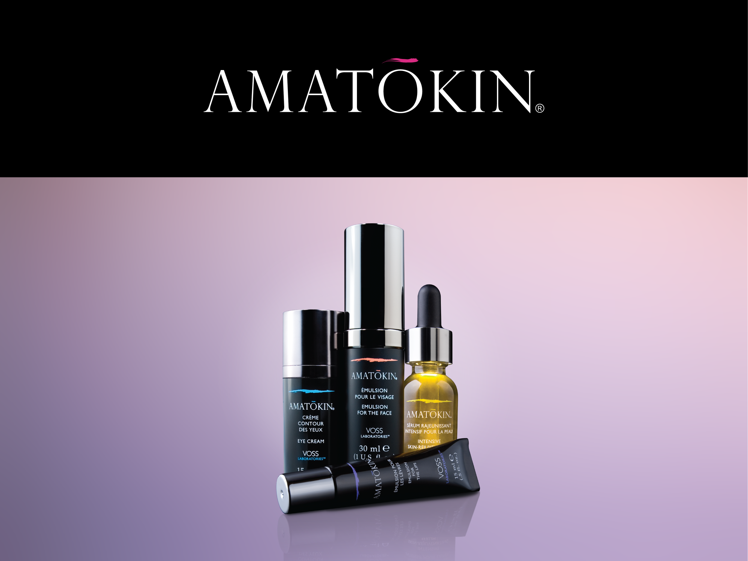
Amatokin is an anti-aging skincare line launched by Voss Laboratories in 2008. Originally developed by scientists to treat burn victims, the brand's unique formula works by stimulating the skin's own stem cells. It was sold as a luxury, high-end emulsion at high-end department stores like Bloomingdale's and Harvey Nichols. To bring this luxury presence to life online, Amatokin needed a comprehensive web experience to educate consumers on their approach to anti-aging and provide an intuitive e-commerce platform for product sales.
To achieve this, I collaborated closely with a fellow designer to on the concepting, wireframing, and UI/UX design from the ground up. We translated Amatokin’s clean and modern aesthetic into an intuitive, modern e-commerce platform that successfully accomplished the client goals of educating consumers and increasing sales.
Client
Amatokin
2009
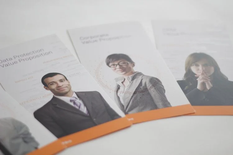
Worked with a team of designers to rebrand SafeNet, based in Belcamp, MD. Safenet is the fifth largest vendor in the security market and third largest provider of information security solutions in the world.
Client
SafeNet
2010–2012
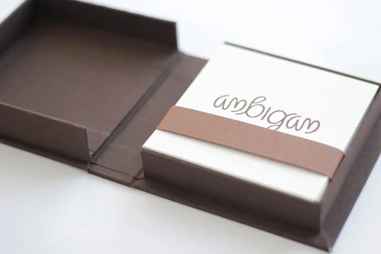
Personal typography project exploring the ambigram—a word designed to remain legible when inverted or rotated 180 degrees. I selected 10 words, created each ambigram by hand, and letterpressed the final designs myself. To package the collection, I used traditional bookbinding techniques to create a custom cloth-covered box.
Client:
Personal
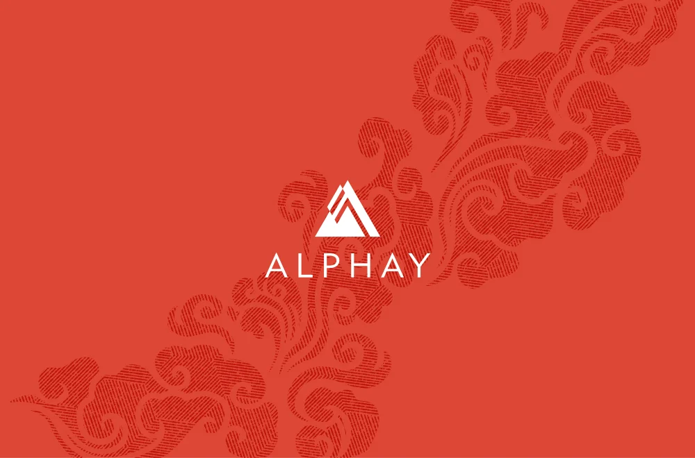
Art directed a team of designers to rebrand the western arm of Alphay, a global health and nutrition company headquartered in Vancouver, British Columbia. The rebrand included logo design, websites, coffee and tea packaging, brochures, event signage, and multiple photoshoots.
Client
Alphay
2013–2015
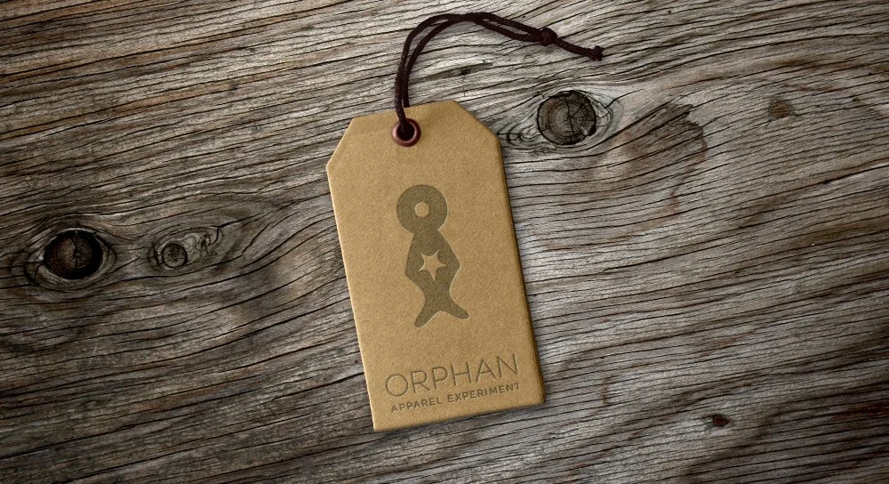
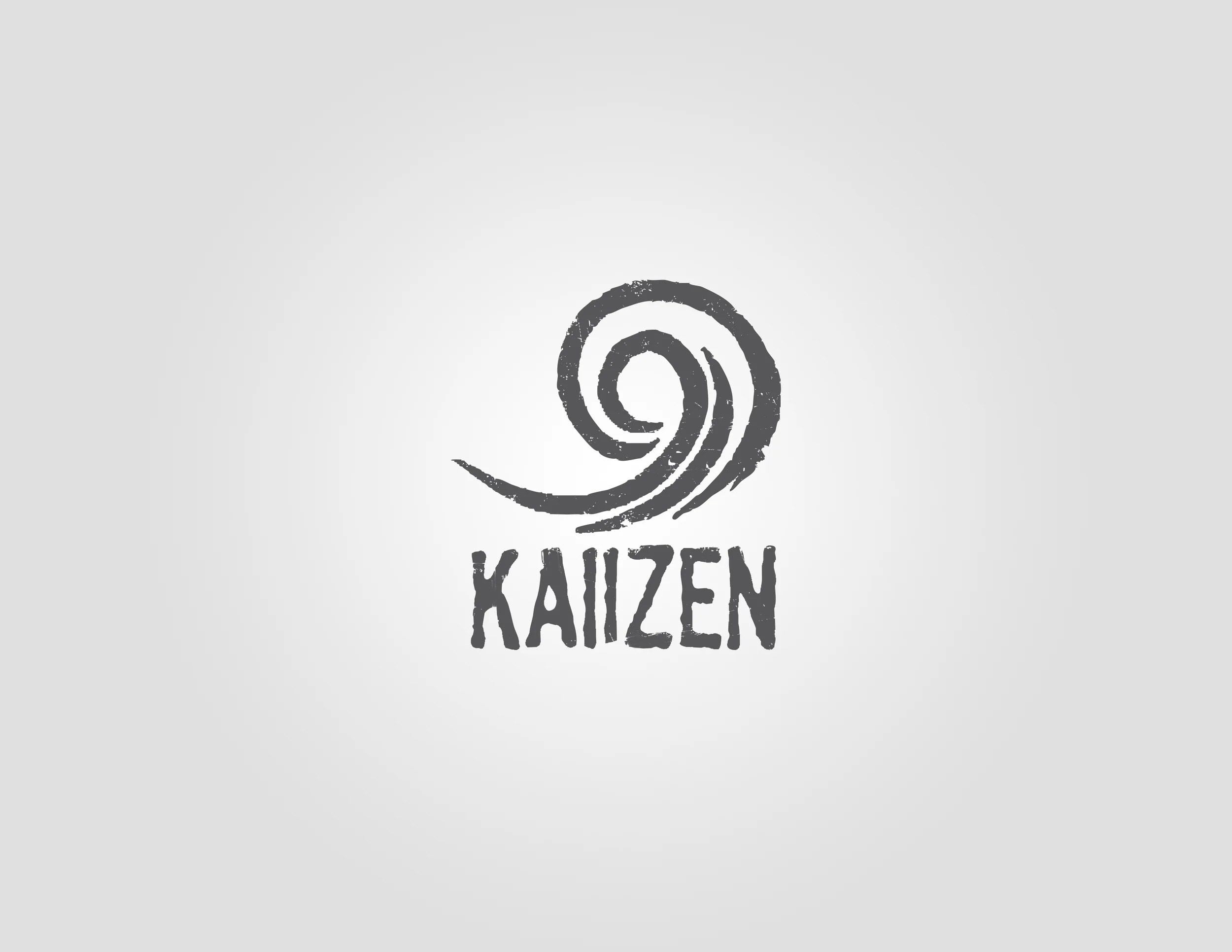
Logo recommendation for a local non-profit skateboard company that would have raised money to help orphanages around the world. The project ended up not moving forward, but the client still continues to help kids with the great Kaiizen Foundation.
Client
Kaiizen
2008
Personal project.
Personal project. I took on a conceptual rebranding for Utah's premier Indian restaurant chain. This project explores a modernized visual identity for the brand while preserving its rich cultural roots. I focused on creating a cohesive brand system from the ground up, designing a contemporary logo, establishing updated typography and color palettes, creating patterns inspired by Indian culture, and applying the branding to physical assets such as business papers and condiment packaging.
Client
Personal
Personal project.
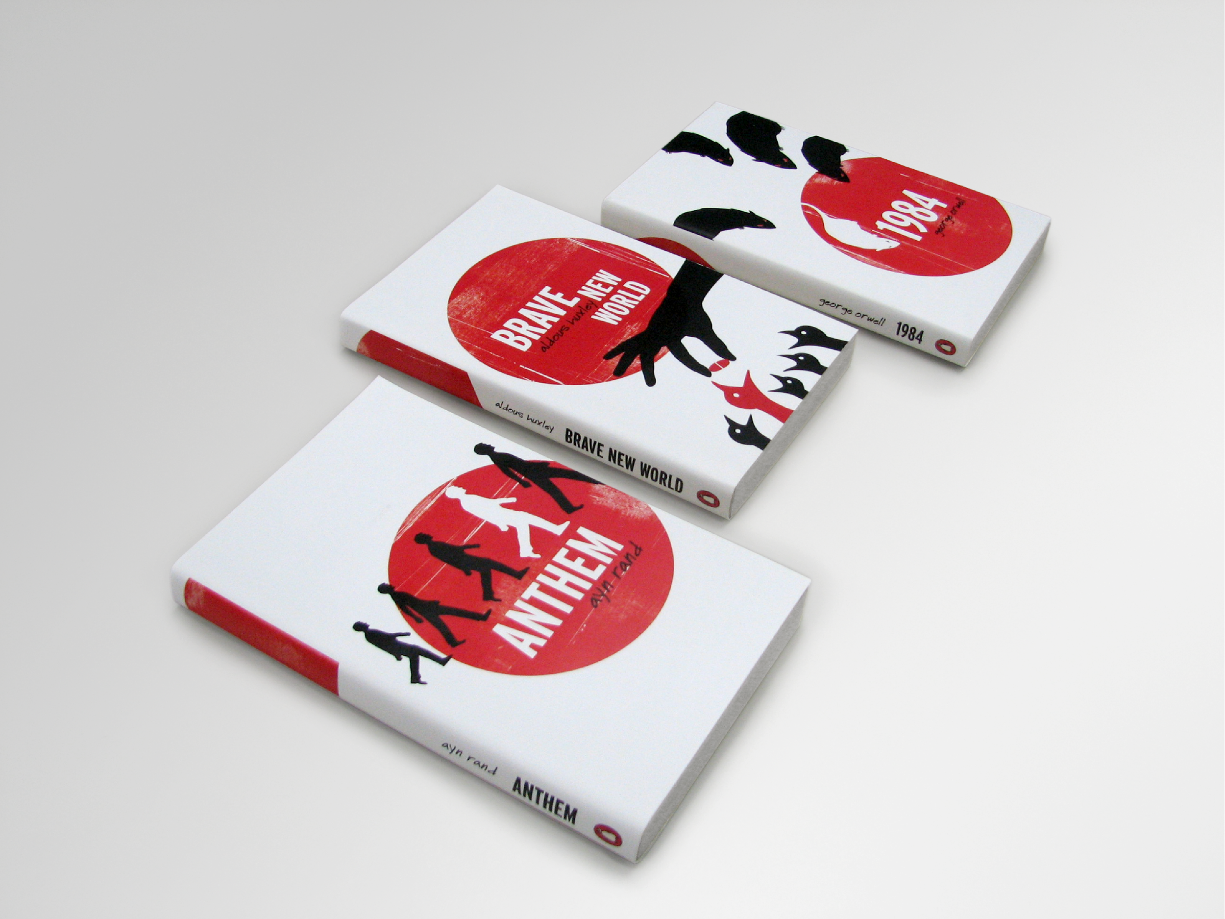
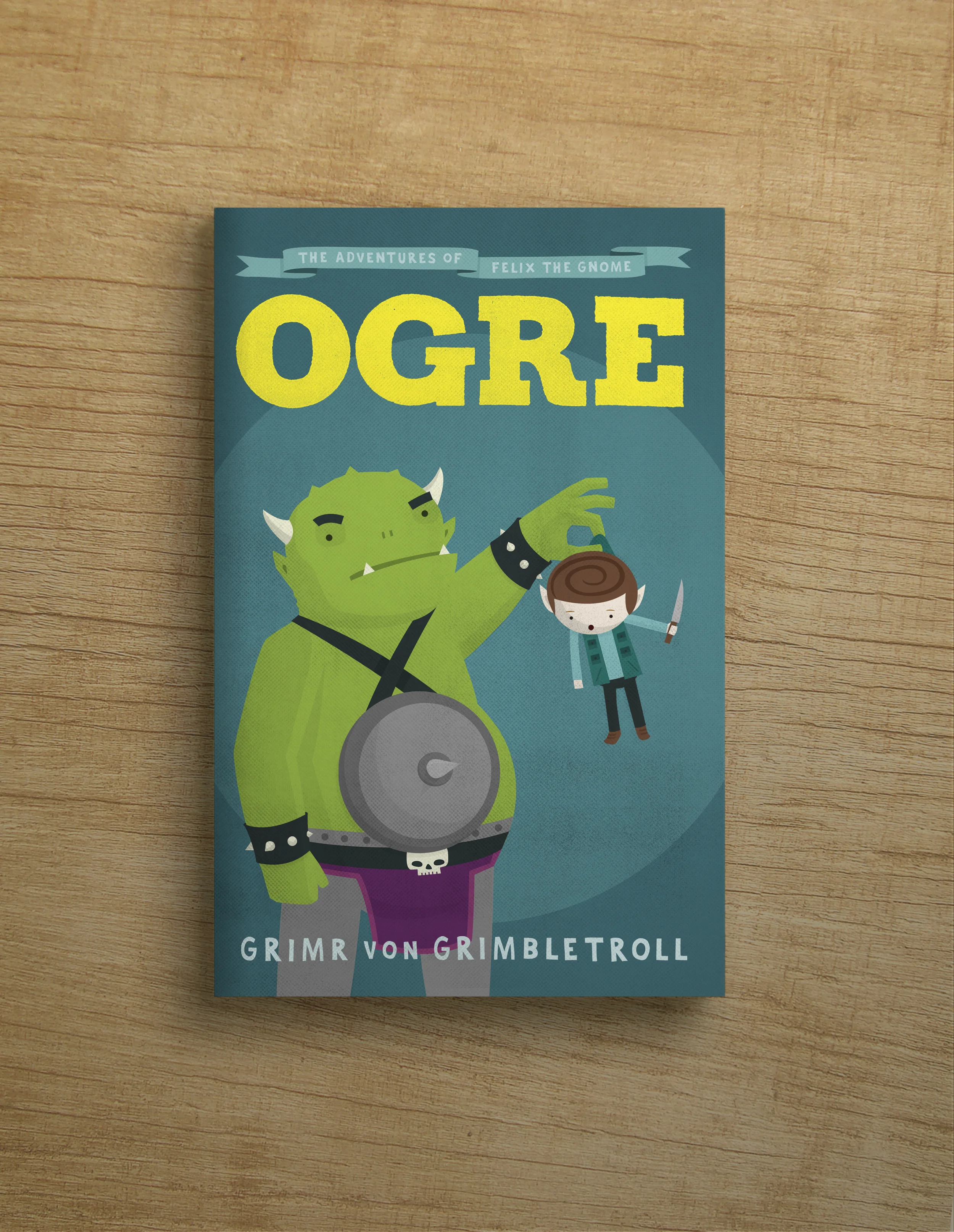
Personal project. I wanted an excuse to design and illustrate a set of covers in a minimalist style reminiscent of the style of Saul Bass film posters and title sequences.
Client
Personal
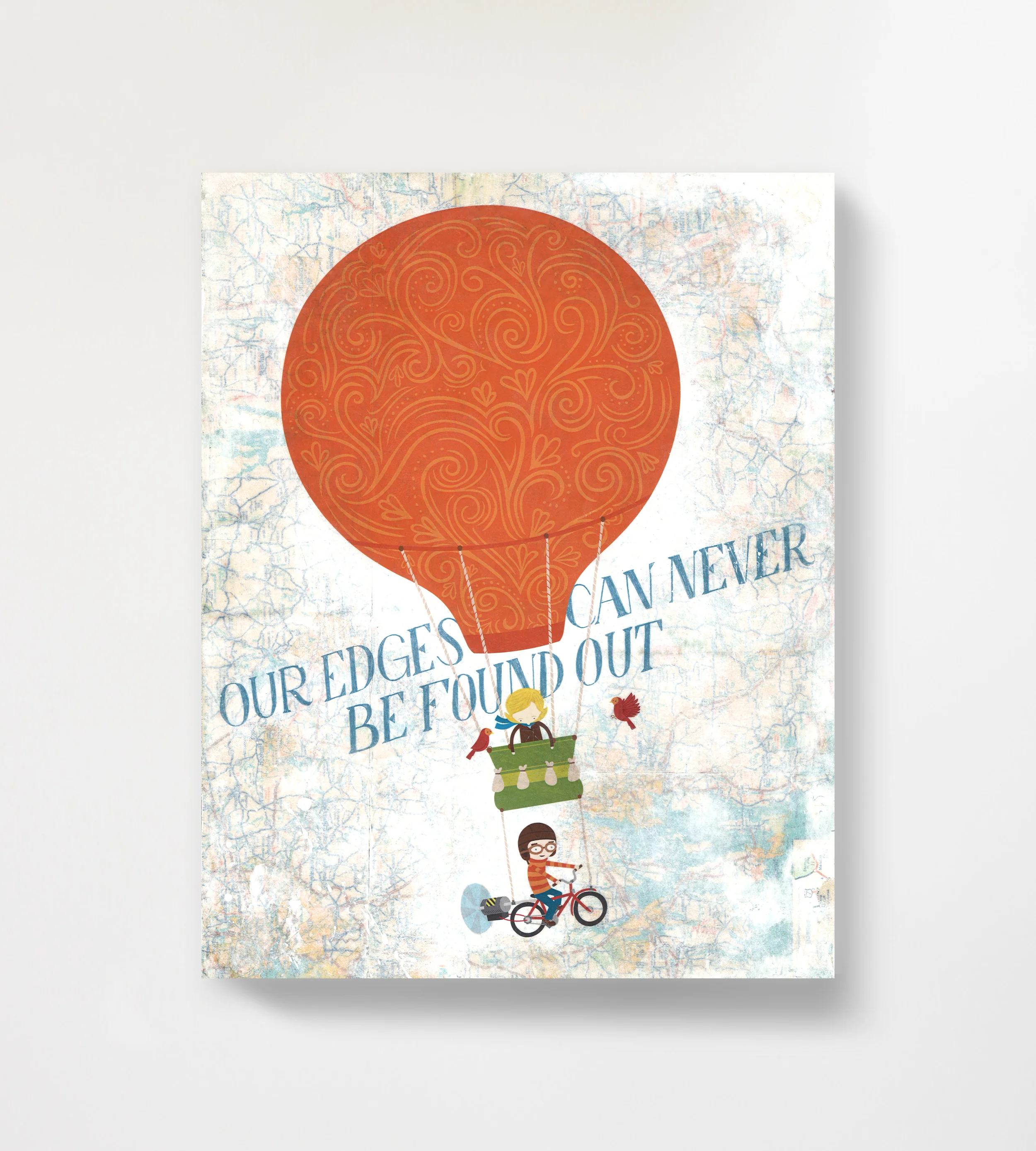
Part of a gallery show on the theme of Travel. The typography is based on lyrics from songs by My Brightest Diamond, Modest Mouse, and Pink Floyd, respectively.
Client
Personal
A collection of various personal creative projects from over the years.
Client
Personal
Created a logo for Kaiizen Foundation, a non-profit organization that serves underprivileged children (mostly orphans) through a workforce of college-aged volunteers. Its name is intentionally resemblant of "kaizen," a Japanese term roughly meaning "continual improvement" in English.
Client
Kaiizen
2005–2008
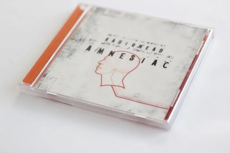
My own personal take on the packaging for the Radiohead album Amnesiac.
Client
Personal Project
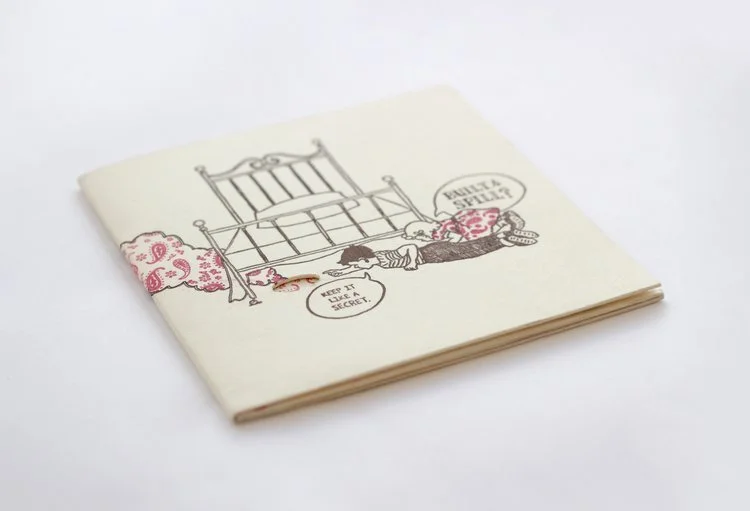
Personal project. My own take on the album packaging for the Built to Spill album, Keep it Like a Secret. I illustrated and personally letterpressed all of the artwork, and put together final product by hand.
Client
Personal Project
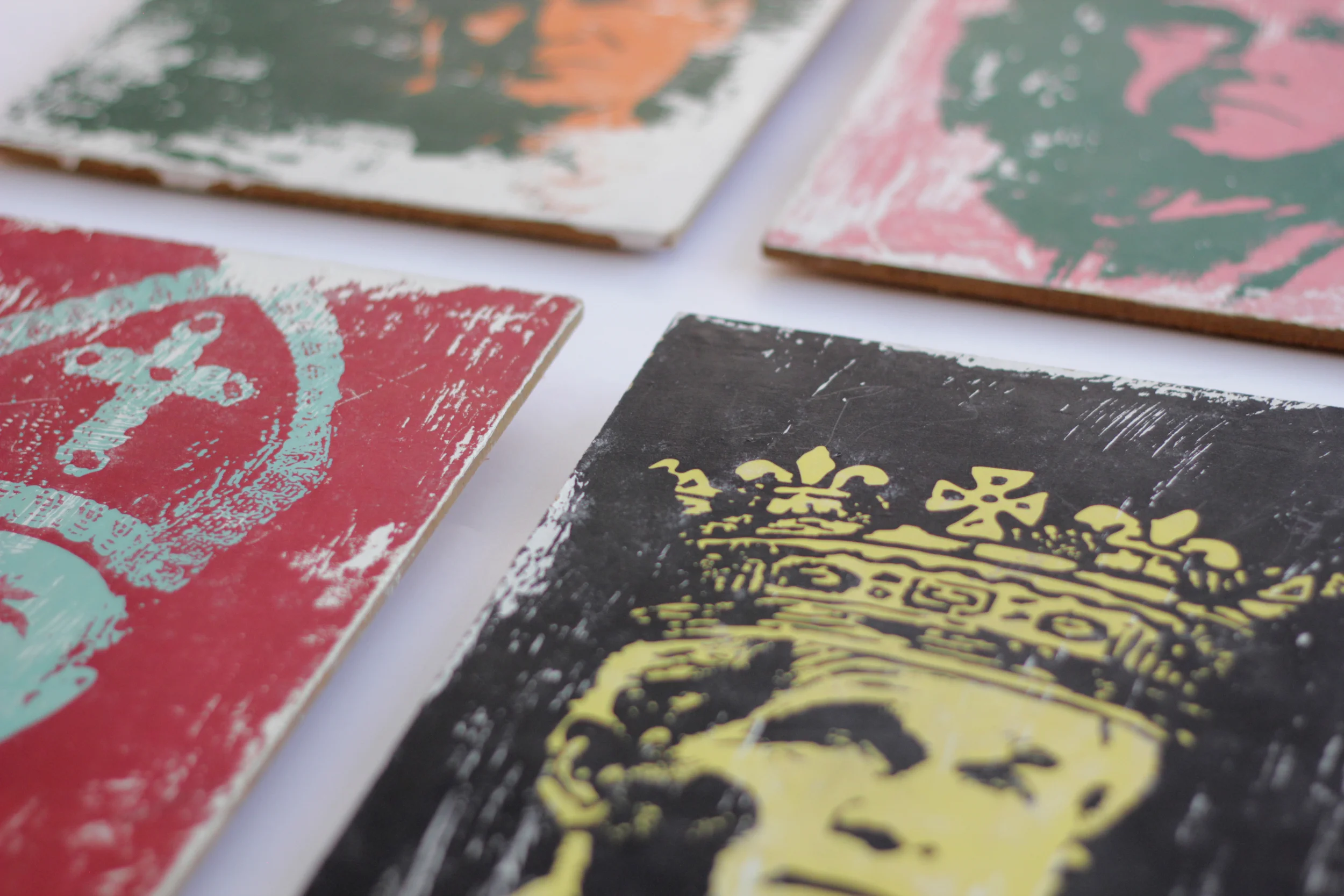
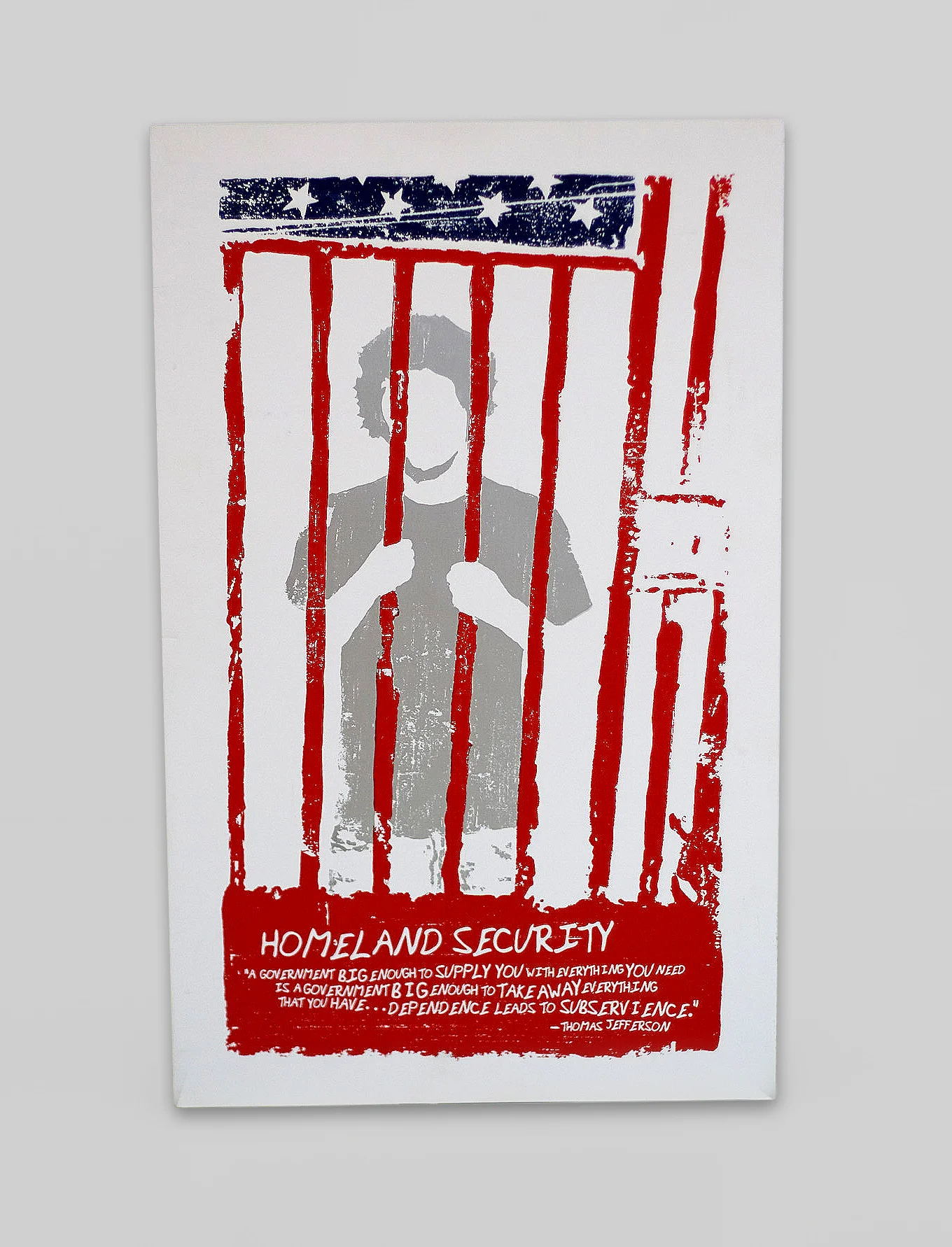
Personal screen-printing project.
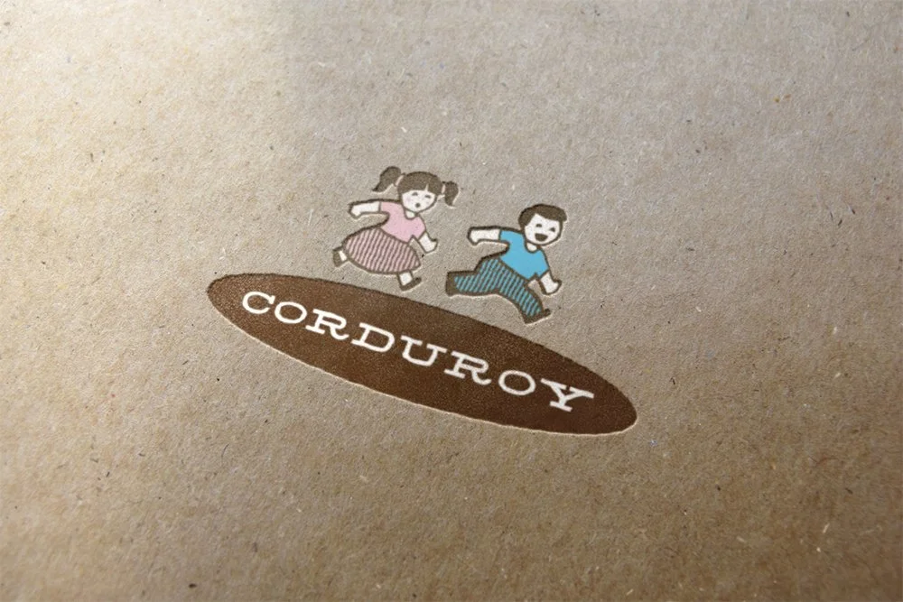
Concept ideation, naming, and brand identity for Corduroy, an original thrift store idea I developed. I created the business idea around a curated secondhand shopping experience. The project includes typography, colors, and retail packaging assets that pairs vintage illustrations and colors with tactile textural elements.
Client:
Personal Project
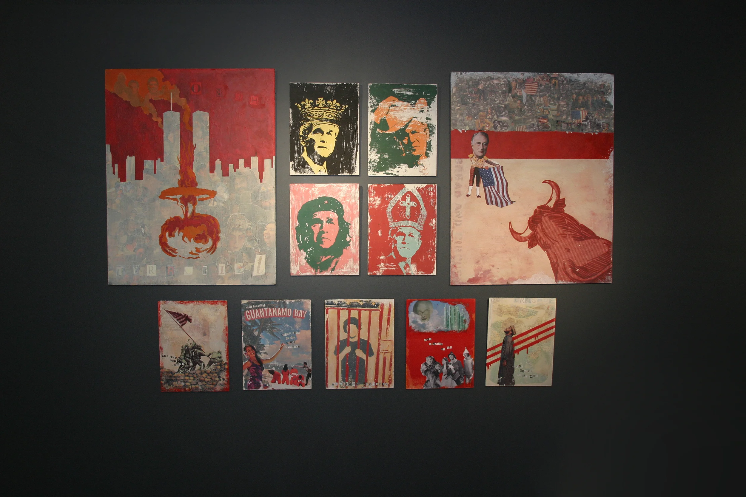
Personal project on the theme of anarchy, or spontaneous order.
Client:
Personal Project